
I have lots of friends throughout the PACS world (and a few enemies here and there, too). Because of one friendship established several vendors ago (for my friend, that is) I have the rare honor of introducing a new ad campaign for Dynamic Imaging. Rather catchy..."Don't Just Read, Read Well".... That is what we are supposed to be doing, right? (Forgive me, but being on a constant diet makes me substitute the word "eat" for "read", but that only enhances the attractiveness of the catch-phrase.) The ad goes on to ask what your patients might think if they could look inside your PACS. For some of the systems we GEt to use, that could be a real joke.
I've tried to get Amicas to create a campaign around my slogan, "It doesn't get in your way", but so far I haven't seen any ad copy, nor have I received any checks in the mail. Perhaps I forgot to send in my address.....
If you click on the ad above, you will see an enlarged version. The PACS station on display is NOT running DI's Integrad Web software, but there is a sort of "generic PACS" using color bars on its worklist. Hmmmmmm. Does that remind you of anything? To my knowledge, there is only one system out there that uses color bars for its worklist, and we all know who that is. I did ask about this, and I was told that there are indeed others out there that do so, like RamSoft, so this was indeed meant to be "generic":
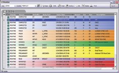
Look, Ma, no colors! I can't come up with anyone else doing color worklists at the moment.
Upon very close perusal, the ad shows the PACS station to be shot full of holes. The gist of the ad is that if your patients were well-enough versed in the PACS field, and could see your system, they would realize as you should realize that your system is full of holes, and should be replaced by DI's Integrad Web. This is a little darker version of the 1989 introductory Infinity ads where you could see babbling brooks and streams, but not the doggone car! Personally, I'd like to see the Integrad Web in action.
Sigh. PACS is a dog-eat-dog world.
5 comments :
McKesson has had a color coded worklist for a couple of years now.
Their color coding is intentionally very subtle, mostly being variations within the blue-green range of the spectrum. The early pre-release prototypes used a lot of different hues (like the example in your blog but not as screamingly loud). However, that was roundly criticized by the pre-release usability testing radiologists as being "too distracting".
So the released version was switched to the more subtle palette. It still allows a clear at-a-glance identification between studies with different workflow states without being so "in your face".
Good comment. That's why it's important for a site to be able to select their own colors. What one might consider "screamingly loud", another might consider appropriate.
Like many ad campaigns, the ad shown here will actually be 1 of 3 in a related series, each with a different generic workstation - each slightly different, but as generic as the others. The message is the focus -- ex. CDs that don't work interchangeably, PACS that can't be accessed remotely & reliably, PACS that are unstable, features that are unusable or unavailable, etc. As with many healthcare apps, if you think how the system impacts patient care, you'll look at the app in a whole new perspective.
I like the add. If patients could really see what happens behind the scenes in a Radiology Department and with PACS, they may become more sophisticated shoppers.
As a Radiology Administrator for more than 10 years, it would be interesting if patients would shop around. Would you run your department differently?
I agree with your statement about the behind the scenes of the radiology department but that is NOT what the AD is pointing out. I've worked in many different types of facilities and there is always the problems with the behind the scenes stuff especially the staffing and the organization of the department. That being said, Dymanic Imaging is taking shots at other PACS vendors instead of promoting their own product. I love the tagline "we take care of your image". Ummm yeah - THAT'S WHAT YOU'RE SUPPOSED TO DO AS A PACS VENDOR. If other PACS are not doing this then that's a problem but I'd like to assume that I don't have to worry about my "image" being safely stored and protected. Their solution looks useable - I got a demo at RSNA 2004. I love the whole resizable viewport concept (a legacy feature from Canon). I also like how they can install on the desktop and not bother other apps. BUT I think they take a back seat to some other vendors in terms of feature / function on the workstation. They apparently don't think they do. The weird tingling feeling on the back of my neck stems from the overall thought that they've cobbled a solution together. I've used a variety of PACS systems over the years - McKesson, GE, SIEMENS, Fuji, Amicas, Merge. They all got the job done without me having to worry that my patients were thinking that I was using a flawed product and providing them substandard care. The DI ad you highlighted infuriated me. The gall of this company to say that my approach to patient care is flawed because I do not use their product. It's a ridiculous statement and now I would NEVER do business with them.
Post a Comment